The thing about minimalist design is that, when done right, it is breathtaking. The same reasons make it unsightly when done incorrectly. Really, getting it right is striking a balance between a small number of design components. It can take a very sharp eye to distinguish between something that will just work and something that just does not, like with a lot of art and design.
The art of minimalism is keeping things straightforward. Some people live this way as a way of life, keeping the clutter out of their homes while focusing on the things that make a house a joyful place. Every element must serve a specific purpose in order to be included in a minimalist web design; otherwise, it is not included.
What is Minimalism web design?

For a variety of reasons, minimalist web design is appealing. In addition to its understated elegance and streamlined design, its clear-cut approach appeals to people who want a user-friendly experience.
Most people and site designers enjoy the challenge of giving just the right amount of information without being cluttered, but doing so requires striking the correct balance between the right number of items. To give visitors a seamless experience, your images must adhere to the theme.
You have many options, even for minimalist design, in terms of the direction you want to go in. But all minimalist web designs must adhere to a certain set of guidelines. Next, we have some great advice on incorporating minimalist web design into your website.
Why is minimalism popular?

The idea of minimalism, which is frequently confused with simplicity, comprises eliminating all but the necessary parts.
This indicates that although minimalism is straightforward, simple or straightforward forms only sometimes equate to minimalism.
Design uses minimalism to directly communicate the idea without extraneous noise and distractions from other parts.
The minimalist approach has been entrenched in many fields of design as designers have realised the advantages of employing minimalism quickly and effectively deliver the message.
3 Tips to Master a Minimalist Web Design
1. Visual Elements:
- Every detail must be important.
- It should work and do what it’s supposed to do.
- So, when you’re designing, think about each part and ask yourself, “Does this detail serve a purpose, or is it just for looks?”
- If it’s just a picture, you need to step back and decide if it fits on your page or makes it too busy.
2. colours and Contrasts:
- Colours must be used well in simple designs.
- Colours should make the page look attractive and grab and direct the user’s attention without needing extra elements or images.
- Colours should be used sparingly, which is why great websites use monochromatic or only two or three key colours.
- The monochromatic colour scheme, which uses different shades of the same colour, is often used because it is soothing to the eye and doesn’t hide the essential parts.
3. White Space:
- This trait, often called “negative space,” can be a web designer’s most helpful tool.
- The white or “negative” space opens up the “room” and gives it room to breathe, which is quite different from how many websites look.
- Use the white room to draw the user’s attention where you want it.
- By adding more space around the information you want the user to pay attention to, you can ensure content pieces stand out.
Minimalist Web Design Do’s
When done right, a simple website design is beautiful. But if you don’t use the right parts, it can also look terrible. To make a simple website that works for people, you need to know the “do’s” of minimalist design.
- Cut the Clutter: Web workers add things to the homepage and the whole website over time. Every part seems useful initially, but they can make the site bigger and bigger until it’s hard to find anything. Stop and think about what each page of your website is mostly for. Anything on the main page that doesn’t move the user toward the goal must go or at least be hidden.
- Balance White Space: Fans of minimalism know how important it is to have the right amount of both positive and negative room. The best simple designs have a lot of space around a few important parts. When you add empty space to your page, it draws attention to the few features you have instead of making the user look through pictures and text to find what they want. When you only include the most important things, you have more room to put things around them.
- Align on a Grid: Even though you can use minimalist elements and make an asymmetrical plan, it can sometimes look like it is missing something. If you aren’t a skilled creator who has worked with minimal designs for a long time, keeping your site on a grid is best. Boxed material helps keep things organised and clean. Grids also give each piece on your page some space around it.
- Try something new: In web design, new styles come and go. A minimalist method works well with many of them. For instance, you can use curves by choosing a few colours. It’s fine to use animation, but make it simple. You don’t want people to get annoyed and leave your site. The process should be as easy as possible for the person.
- Choose colours Wisely: With a minimalist site design, you can use colours. You can’t use all the colours of the rainbow, but you can pick two or three. Use one main colour as your base and the others as highlights. The colours should go well together. If you only use two colours, choose ones that are different from each other, like black and white or navy blue and pale yellow.
Don’ts for Minimalist Design
Just as there are some clear do’s for minimalist design, there are some big no’s.
- Choose Bold Fonts: When you have a simple design, you should spice things up using different fonts. This, unfortunately, can ruin the look of your simple design and take away from its calmness. Use fonts that the customer already knows. You don’t want your type to take attention away from what the page is about. Most of the time, you should avoid the script, hand-drawn, and special styles.
- Pack Everything Into the Nav Bar: You only have a few options on your page, so it might be tempting to put everything in the menu bar. The customer can still use your great features from there, after all. If you want a great minimalist design, your menu should be simple. Choose up to four or five. Avoid mega choices. Consider where people often go on your site and draw attention to those parts.
- Lose Clarity for Simplicity: Ensure your design is simple enough that you remember to tell the user what to do next. Know where the customer is in the buying process and the next step. Is it clear what the user needs to do to get from Point A to Point B? You don’t want your website to be hard to understand in any way. When you do that, it’s bad for the person. Use your best decision. If your people need help with something, fix it.
8 Design Tips for Creating a Clean Minimalist Website
1. Maximize Usability: You want a website’s design to prioritise usability. Choose this response, making sure the primary objective is obvious and that the design maximises the effectiveness of user interaction with your website.
2. Shift the Focus onto the Content: Making sure that information is the main focus is one of the best design advice for minimalism. A fancy website is meaningless if its content is compromised or its main message is somehow watered down. Minimalism shifts the scales in your favour and enables you to benefit.
3. Don’t be intimidated by empty space: The days of utilising every available inch of the page are over. Negative or empty space shouldn’t be feared. In reality, it may be a potent tool for minimalist web design, helping to focus user activity and directing visitors to the sites you want them to see.
4. Make sure the design is purpose-driven throughout: Using a minimalist approach to web design, you can ensure that everything on your site serves a purpose.
It serves a purpose. Cut out the extraneous material from your design as well as your content. This keeps customers on task and makes communicating with your company a quick and enjoyable procedure.
5. A Three-Color Limit: Use carefully chosen colours that complement your brand and other artwork, but use only a few to the point of overwhelming something. a limited colour scheme that makes good use of an accent colour to draw attention to the appropriate regions. Most minimalist advice will suggest keeping your colour palette to no more than three.
6. Don’t be intimidated by various fonts: It takes an artist to really appreciate the impact of a typeface. Feel free to switch things up and use different typefaces to emphasise certain parts of your website or to help draw attention to various regions.
7. Minimalize Applies to Your Images Too: Adopting minimalism in web design requires that you use it throughout the entire website. That also includes photos. You should utilise clear, sharp graphics rather than garish, cluttered ones that detract from the page’s content and overall message, which are what actually matter.
8. Pay attention to intuitive navigation: In your company plan, you mention a website. It has a flow to aid in converting casual onlookers into customers. That process must be easy to follow and intuitive. To provide a better client experience, one of the finest minimalism advice is to concentrate on creating intuitive navigation.
Minimalist web design has become a popular trend due to its focus on simplicity and functionality. It emphasizes the idea that “less is more,” creating clean, user-friendly interfaces that enhance the user experience. However, achieving a minimalist design requires careful consideration of several factors. Here are the dos and don’ts of minimalist web design to guide you through the process.
The Dos
1. Prioritize Content
- Focus on Essentials: Ensure that the content is the centerpiece of your design. Highlight the most important information and eliminate any superfluous elements.
- Clear Typography: Use clear and readable fonts. Typography should guide the user’s attention without overwhelming them.
2. Use White Space Effectively
- Enhance Readability: White space (or negative space) helps to create a clean and organized look, making the content easier to read and navigate.
- Balance Elements: Proper use of white space balances the design elements, providing a comfortable viewing experience and guiding the user’s eyes to important areas.
3. Simplify Navigation
- Intuitive Menus: Create simple and intuitive navigation menus. Users should be able to find what they are looking for quickly and effortlessly.
- Minimize Options: Limit the number of menu items to prevent overwhelming users. Prioritize the most important links.
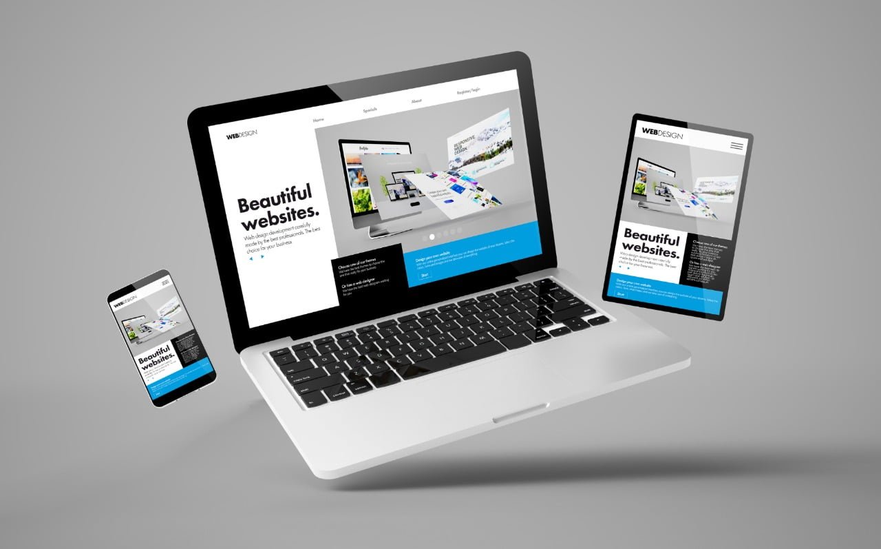
4. Utilize High-Quality Visuals
- Sharp Images: Use high-resolution images that are relevant to the content. Blurry or irrelevant images can detract from the minimalist aesthetic.
- Meaningful Icons: Icons should be simple, universally recognizable, and used sparingly to aid navigation and understanding.
5. Consistent Color Scheme
- Limited Palette: Stick to a limited color palette that complements your brand and enhances the minimalist look. Generally, two to three colors are sufficient.
- Contrasting Colors: Use contrasting colors to highlight important elements and calls to action (CTAs).
6. Optimize for Performance
- Fast Loading Times: Ensure your website loads quickly by optimizing images, using efficient coding practices, and minimizing the use of heavy scripts.
- Responsive Design: Your website should be responsive and look great on all devices, from desktops to smartphones.
7. Thoughtful Use of Animations
- Subtle Animations: Use animations sparingly and ensure they are subtle. They should enhance the user experience, not distract from it.
- Functional Animations: Animations should have a purpose, such as providing feedback on user interactions or guiding the user’s attention.
The Don’ts
1. Avoid Clutter
- Excess Elements: Do not overload your pages with unnecessary elements, which can confuse and distract users.
- Text Overload: Avoid long blocks of text. Break content into manageable chunks with headings and bullet points.
2. Don’t Neglect Mobile Users
- Unresponsive Design: Ensure your minimalist design is fully responsive. A design that looks great on a desktop might not translate well to smaller screens.
- Touch-Friendly Elements: Make sure interactive elements are large enough to be easily tapped on mobile devices.
3. Don’t Overuse Effects
- Flashy Animations: Avoid using flashy animations or effects that can slow down your site and distract users from the content.
- Unnecessary Features: Do not include features just for the sake of having them. Every element should have a clear purpose.
4. Don’t Sacrifice Usability for Aesthetics
- Complex Navigation: Avoid complex navigation structures that make it difficult for users to find what they need.
- Hidden Elements: Do not hide important elements such as navigation menus or contact information. They should be easily accessible.
5. Don’t Ignore Accessibility
- Inaccessible Design: Ensure your design is accessible to all users, including those with disabilities. Use appropriate contrast ratios, alt text for images, and keyboard navigability.
- Ignoring Standards: Follow web accessibility standards (such as WCAG) to ensure your site is usable by everyone.
6. Avoid Inconsistent Design
- Mismatch Styles: Maintain a consistent style throughout your website. Inconsistent design elements can confuse users and disrupt the flow.
- Random Changes: Avoid making random changes to your design. Any update should be well-thought-out and tested.
7. Don’t Forget SEO
- Neglecting SEO: A minimalist design should still incorporate good SEO practices. Use appropriate tags, meta descriptions, and keyword placement to ensure your site is discoverable.
- Ignoring Analytics: Monitor your site’s performance and make data-driven decisions to improve user experience and engagement.
Conclusion:
Remember that you should keep it clean, keep it structured, and ensure that your text and photos provide only the necessities and nothing more. If you are interested in making changes to your website on your own, keep the advice and suggestions given above in mind, and the process will go off without a hitch.
Frequently Asked Questions:
It has simple shapes, clean lines, and a monochrome colour scheme. Colour is only used as an accent. It generally has an open floor plan, a lot of natural light, and useful furniture. It also focuses on the shape, colour, and texture of just a few key elements.
This is shown by simplicity in marketing, branding, and product strategy in three main ways: fewer words, clean images, and fewer choices. Using this kind of approach can both make Localization easier and cause problems.
SEO is helped by minimalist web design because it makes it easier for search engines to figure out what your site is about. Also, simple pages open faster because they have less stuff on them. This combination will help your site rise higher in search engines.
As some of the most important parts of minimalist design, uniformity, symmetry, and balance are important things to pay attention to when working with a minimalist idea.