About Data Visualization
Data visualization is the process of representing information and data in a graphical or visual form. It involves using visual elements such as charts, graphs, maps, and other forms of visualizations to help people understand and analyze data. The purpose of data visualization is to present complex information in an easy-to-understand manner, making it easier for people to identify patterns, relationships, and trends within the data.
Data visualization is an important tool in data analysis and decision-making. It allows data analysts and decision-makers to gain a better understanding of the data they are working with, which in turn enables them to make more informed decisions. By visualizing data, it is easier to identify patterns, outliers, and trends that may be difficult to see in raw data. This can lead to better insights, more accurate predictions, and more effective decision-making.
There are many types of data visualization, including static and interactive visualizations. Static visualizations are charts, graphs, and other visualizations that are static and cannot be interacted with. Interactive visualizations, on the other hand, allow users to interact with the data and explore it in more detail. Interactive visualizations can be particularly useful when dealing with large and complex data sets, as they allow users to drill down into the data and identify specific patterns and trends.
Data visualization is used in a wide range of industries and fields, including business, finance, healthcare, and government. In business, data visualization is used to analyze sales data, customer behavior, and other business metrics. In finance, data visualization is used to analyze market trends, stock prices, and other financial data. In healthcare, data visualization is used to analyze patient data, disease trends, and other healthcare metrics. In government, data visualization is used to analyze economic data, social trends, and other government metrics.
Data visualization is a powerful tool that enables data analysts and decision-makers to gain a better understanding of complex data. By visualizing data, it is easier to identify patterns, relationships, and trends that may be difficult to see in raw data. Data visualization is used in a wide range of industries and fields, and it plays an important role in data analysis and decision-making.
Goals of data visualization

Data visualization has multiple goals that help to transform raw data into meaningful insights. The following are the goals of data visualization along with their explanations:
Communicating information clearly and efficiently:
The primary goal of data visualization is to present complex data in a simple and understandable format. It helps in creating an efficient communication channel between the data analyst and the audience. Effective visualization techniques make it easy for the audience to comprehend and interpret the data with minimal effort.
Highlighting patterns and trends:
Data visualization aims to highlight patterns and trends within data, which are not easily discernible in tables or text-based formats. It helps in identifying the most important trends, patterns, and insights that can be leveraged for effective decision-making.
Identifying outliers and anomalies:
Outliers and anomalies are data points that do not conform to the expected pattern or trend. Visualizing data helps in identifying such outliers and anomalies and enables the analyst to investigate further to determine their cause.
Comparing data:
Visualizing data enables the analyst to compare data across different dimensions, such as time, geography, or product categories. By comparing data, analysts can identify patterns and trends that are not visible when analyzing individual data sets.
Exploring data:
Data visualization enables the analyst to explore data and generate new insights that were not previously identified. By visually exploring data, analysts can identify correlations and relationships that were not previously apparent.
Telling stories with data:
Data visualization helps to tell stories with data. It enables the analyst to convey a narrative and make a point through the use of visual aids. By creating engaging and interactive visuals, analysts can help their audience to understand complex data sets and the insights that can be gleaned from them.
Providing insights for decision-making:
Data visualization provides insights that can be leveraged for effective decision-making. By presenting data in an easily understandable format, analysts can help decision-makers to identify patterns and trends that can be used to drive business decisions.
Why Data Visualization is important
Simplifies complex data:
Data Visualization transforms complex and massive data sets into simple and understandable visual representations, making it easier for people to comprehend the information. This simplification enables people to quickly extract valuable insights and patterns from the data, which might have been difficult to spot otherwise.
Increases efficiency:
Data Visualization saves time and effort by presenting data in a concise and easily understandable manner. When data is presented visually, it allows people to quickly identify trends, patterns, and correlations. This makes decision-making more efficient and helps people to prioritize actions based on the insights gained.
Enhances communication:
Data Visualization is an effective way of communicating data-driven insights to a wide range of audiences. Instead of presenting data in long, detailed reports, visualizations make it easier to convey the main points in a clear and concise manner. It also enables people to share their findings with others in a more engaging and interactive way.
Improves decision-making:
Data Visualization provides people with an intuitive way of analyzing data and extracting insights, which can help in making informed decisions. By visualizing data, people can see how different factors are related to one another, and how they impact business operations. This allows for better decision-making by identifying areas of improvement or areas where resources can be more efficiently allocated.
Enables discovery:
Data Visualization helps to identify patterns and insights that might have been otherwise hidden in the data. By visualizing the data in different ways, people can uncover new insights and gain a deeper understanding of the information at hand. This enables organizations to discover new opportunities or identify potential problems before they become too significant.
Increases engagement:
Data Visualization increases engagement by making data more interesting and interactive. With visualizations, people can explore and interact with data in a more engaging way, which encourages greater participation and interest in the information being presented. This helps to create a data-driven culture where people are more likely to use data to inform their decisions.
Data Visualization is essential for understanding complex data sets and making informed decisions. It simplifies data, increases efficiency, enhances communication, improves decision-making, enables discovery, and increases engagement. By leveraging Data Visualization, people can gain a deeper understanding of their data and use it to make better decisions that drive their organizations forward.
Pillars of data visualization
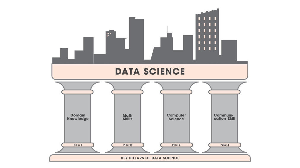
Data visualization is a crucial aspect of data analysis that helps in representing complex data in a more understandable and accessible form. There are several key pillars of data visualization that contribute to creating effective and impactful visualizations. Let’s explore these pillars in more detail:
Purpose:
The first pillar of data visualization is purpose, which involves identifying the reason for creating a visualization. Understanding the purpose of the visualization helps in determining the appropriate type of visualization and the most relevant data to include. The purpose of the visualization may be to inform, persuade, or entertain the audience.
Data:
The second pillar of data visualization is data, which involves collecting and organizing data in a meaningful way. Data should be accurate, relevant, and sufficient to support the purpose of the visualization. The data should also be cleaned and transformed to ensure that it is in a suitable format for visualization.
Design:
The third pillar of data visualization is design, which involves creating visualizations that are aesthetically pleasing and easy to understand. Design elements such as color, typography, and layout should be used in a way that enhances the message of the visualization. The design should also be consistent with the purpose of the visualization.
Functionality:
The fourth pillar of data visualization is functionality, which involves ensuring that the visualization is interactive and user-friendly. Interactive elements such as filters and hover-over tooltips can help users explore the data and gain a deeper understanding of the message. The visualization should also be accessible to users with different abilities.
Storytelling:
The fifth pillar of data visualization is storytelling, which involves using data to tell a compelling story. The visualization should have a clear narrative that guides the audience through the data and highlights the key insights. The story should be engaging and relevant to the audience.
Context:
The sixth pillar of data visualization is context, which involves providing additional information that helps the audience understand the data better. Contextual information can include annotations, labels, and captions that explain the meaning and significance of the data. The visualization should also be presented in a context that is relevant to the audience.
Feedback:
The seventh pillar of data visualization is feedback, which involves collecting feedback from the audience to improve the visualization. Feedback can be gathered through surveys or user testing to identify areas of the visualization that are confusing or unclear. The feedback should be used to refine the visualization and improve its effectiveness.
Benefits of Data Visualization
Data visualization is the graphical representation of data and information. It involves the use of visual elements like charts, graphs, and maps to help people understand and interpret data. With the increasing volume of data being generated, data visualization has become an essential tool for businesses, researchers, and analysts. In this article, we will explore the advantages of data visualization.
Makes data understandable
One of the primary advantages of data visualization is that it makes data understandable. Charts and graphs can convey complex data in a way that is easy to comprehend. When data is presented in a visual format, it is easier to identify patterns, trends, and relationships. This allows decision-makers to quickly understand the data and make informed decisions.
Facilitates communication
Data visualization facilitates communication between different stakeholders. When data is presented in a visual format, it becomes easier to share and discuss. This is because charts and graphs are more engaging than raw data, and they make it easier for people to understand the data. Data visualization also makes it possible to present data in a way that is tailored to the needs of the audience.
Helps in data exploration
Data visualization allows analysts to explore data more effectively. When data is presented in a visual format, it becomes easier to spot outliers and anomalies. This is because charts and graphs make it possible to see patterns and relationships that may not be apparent in raw data. Data visualization also makes it possible to interact with data, allowing analysts to drill down and explore data at different levels of granularity.
Improves decision-making
Data visualization improves decision-making by providing decision-makers with the information they need to make informed decisions. When data is presented in a visual format, decision-makers can quickly identify patterns, trends, and relationships. This allows them to make decisions based on data rather than intuition or guesswork.
Enhances data storytelling
Data visualization enhances data storytelling by making it possible to tell a compelling story with data. Charts and graphs can be used to create visual narratives that help people understand complex data. This is because visual elements like colors and shapes can be used to highlight important points and emphasize key messages.
Makes data more accessible
Data visualization makes data more accessible by presenting it in a way that is easy to understand. This is particularly important for non-technical stakeholders who may not have the expertise to interpret raw data. Charts and graphs make it possible to present data in a way that is intuitive and engaging, making it more accessible to a wider audience.
Encourages data-driven decision-making
Data visualization encourages data-driven decision-making by making it easier to analyze and interpret data. When data is presented in a visual format, decision-makers can quickly identify trends and patterns. This allows them to make decisions based on data rather than intuition or guesswork.
Improves data quality
Data visualization can also help improve data quality. This is because charts and graphs can be used to identify data quality issues like missing data, outliers, and inconsistencies. This allows analysts to clean the data and improve its accuracy before it is used for analysis.
Promotes collaboration
Data visualization promotes collaboration between different stakeholders. When data is presented in a visual format, it becomes easier to share and discuss. This makes it possible for different stakeholders to work together to identify patterns and relationships in the data.
Increases efficiency
Finally, data visualization can increase efficiency by making it easier to analyze and interpret data. When data is presented in a visual format, analysts can quickly identify patterns and relationships. This allows them to focus on the most important aspects of the data, saving time and increasing efficiency.
Features of data visualization
Visual representations:
One of the most important features of data visualization is its ability to present complex data in a simplified visual form. This makes it easier for users to understand and interpret the information, as they can quickly identify trends, patterns, and outliers.
Interactive capabilities:
Data visualization tools often have interactive capabilities that allow users to drill down into the data and explore different aspects of it. For example, users can filter data based on specific criteria, zoom in or out of charts and graphs, or click on different data points to view more detailed information.
Real-time updates:
Another feature of data visualization is the ability to provide real-time updates. This is especially important for businesses and organizations that need to track their performance or monitor key metrics. Real-time updates allow users to quickly identify any issues or opportunities and take appropriate action.
Customizable views:
Data visualization tools often offer customizable views that allow users to tailor the presentation of data to their specific needs. For example, users can choose from different chart types, color schemes, and labels to create a visual representation that is most effective for their audience.
Data integration:
Data visualization tools can also integrate with other data sources, such as databases or APIs, to provide a comprehensive view of the data. This integration allows users to access and analyze data from multiple sources in a single platform, which can save time and improve accuracy.
Data storytelling:
Data visualization can also be used to tell a story with data. By presenting data in a narrative format, users can help their audience understand the context and meaning behind the numbers. This is especially useful for presentations or reports that need to communicate complex data to a non-technical audience.
Predictive analytics:
Finally, some data visualization tools also offer predictive analytics capabilities. By analyzing historical data and identifying trends and patterns, these tools can help users make predictions about future outcomes. This can be especially useful for businesses and organizations that need to make strategic decisions based on data-driven insights.
Limitations of data visualization
Limited Interpretation:
One of the main limitations of data visualization is that it can be interpreted in different ways by different people. The same chart or graph can convey different messages to different people, leading to confusion and misunderstandings. This is especially true when complex data is being presented, which can be difficult to interpret without proper context.
Limited Scope:
Data visualization can only present a limited view of the data, which can be both a strength and a limitation. While visualizations can provide a quick and easy overview of the data, they may not reveal the full picture. Certain data points may be missed, and patterns or trends that are not immediately apparent may be overlooked.
Limited Data Quality:
Data visualization is only as good as the data it is based on. Poor quality data can lead to inaccurate and misleading visualizations. This can happen when data is incomplete, biased, or inconsistent. Therefore, it is important to ensure the accuracy and consistency of the data before creating visualizations.
Limited Context:
Another limitation of data visualization is that it may not provide enough context for the data being presented. Visualizations may lack the background information necessary to fully understand the data and the context in which it was collected. This can lead to misinterpretation and miscommunication.
Limited Audience:
Data visualization may not be suitable for all audiences. Some people may have difficulty understanding visualizations, or may not be able to access them due to visual impairments. In addition, certain types of data may be sensitive or confidential, and may not be appropriate for public display.
Limited Toolset:
While there are many data visualization tools available, each tool has its own limitations. Some tools may be better suited for certain types of data or visualizations than others. In addition, many tools require a certain level of technical expertise to use effectively, which can limit their accessibility.
Limited Scalability:
Data visualization may not be scalable to large datasets or complex data structures. Large datasets may require more complex visualizations or data processing techniques, which may not be supported by all tools. In addition, data structures may be too complex to represent visually, leading to a loss of detail and accuracy in the visualization.
Limited Insights:
Data visualization can only reveal what is already present in the data. It cannot provide insights or predictions that are not already embedded in the data. Therefore, data visualization should be used in conjunction with other analytical techniques to gain a deeper understanding of the data.
Conclusion
Overall, data visualization is a critical tool for anyone working with data, whether in business, research, or everyday life. By mastering the principles of effective data visualization, individuals and organizations can better understand their data and make more informed decisions based on their findings.
Frequently Asked Questions
There are many different types of data visualizations, including bar charts, line graphs, scatter plots, heat maps, pie charts, and histograms.
Effective data visualizations should be simple, clear, and easy to read. They should also use color, typography, and other design elements to enhance the message being communicated.
Common mistakes to avoid when creating data visualizations include using too many colors, adding unnecessary visual elements, and using inappropriate chart types.
Data visualization can be used in business to help executives and managers make more informed decisions, track performance metrics, and communicate complex information to stakeholders.
There are many different data visualization tools available, including Tableau, Power BI, Excel, Google Data Studio, and D3.js.
Data visualization focuses on presenting data in a graphical format, while infographics combine data visualization with text and other design elements to tell a story or make a point.
Data visualization can be used in scientific research to help identify patterns and trends in data, communicate findings to other researchers and stakeholders, and make complex information more accessible to non-experts.
Data visualization can be used in journalism to help tell stories and present complex information in a more accessible and engaging way. It can also help journalists uncover new insights and trends in data.